The Impact of Keeping it Simple

This is something anyone who has taken a class or workshop with me has heard a million times and especially when it comes to creating decks.
Keep it simple. The less words the better. Give me bullets vs. sentences. What is the heart of what you are saying? Leave them with the idea and asking for more.
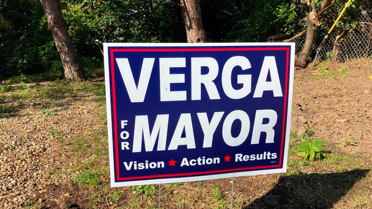
I was on a walk during election season somewhere up in New England and I thought of this as I saw this election sign. And what really struck me was seeing this sign next to ALL the others in adjoining yards.
Now, I know NOTHING about the candidates or the town so this is merely for example sake but it so beautifully illustrates what I try to convey in my deck classes. You have very limited space on a sign to persuade (much less than a pitch deck) so what are you going to choose to include?
Clearly sentences would be unreadable and would completely lost.
Many just put their name, which tells me nothing.
This sign picks 3 words (with bullets between) that are easy to read and yet allow me to get in one glance what the candidate is about...Vision, Action and Results.
Brilliant!
The others? Too hard to read because they are including too much, have a distracting layout or added unimportant information for the intent of the sign.
I hope this example is as impactful for you as it was for me. KEEP IT SIMPLE!

